There are no sharp value changes nor too many values in the blue Iris that I have been working on. They are so close together that I thought it would be well worth the time to make a value chart to observe its range more closely.
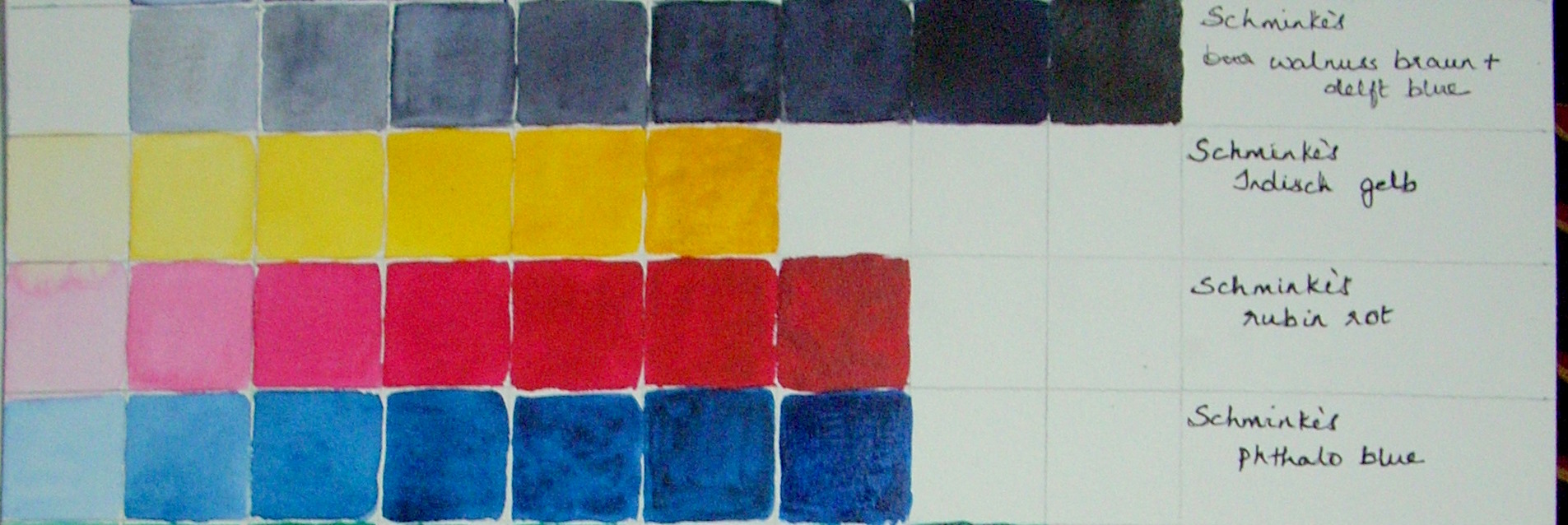
Here is a quick intro on values for anyone of you who are a bit unsure on this. Any color basically has three properties, hue, value and chroma. The hue is the name of the color like yellow ,red, blue etc. Value is the lightness or darkness of a color. Chroma is the intensity or saturation or how ‘bright’ we perceive the color to be. In nature there are an infinite number of colors and values but we have to reduce them to something that we can manage in our art. A minimum of 3 values is required to define a form – the highlight, where the sun rays directly hit the object which makes the color of the object look paler than it actually is, the mid value which can be the actual color of the object and a dark value on the opposite side, which is in shade and therefore looks darker and duller than the actual color. To make the object look more realistic, however, we need to use more values. When you look at a black and white photograph, you are looking at the values without the hue. This gray scale version can be useful in determining the value of a color without the color distracting you. You can make a black and white photo from your reference photo with any image editing software, like Picasa which is free to download. Here is a 9 scale value chart that I have made (the topmost row) with a mix of delft blue and walnut brown to get a black. If you have trouble distinguishing between adjacent values, try a 6 scale value range. It’s easier to do it at first with a 6B pencil than in watercolors because of the drying shifts in watercolors. The blackest black you can make with a pencil is the sixth value and the white of the paper is the first value. All the values in between have to get darker progressively towards black.

You can make a chart of the most used colors in your palette in rows of one inch squares on a watercolor sheet, starting with a black or any dark color for reference. You will see that for some colors like yellow and oranges, you cannot get to the other end of the value range. The color that you see straight from the tube is the maximum value that you can get from that color. By diluting it with water step by step , you can get the values down to 1. Some colors like dark blues and browns go the entire way from 1 upto 9. In the three colors above, indian yellow , ruby red and phthalo blue you can observe an interesting fact. (I forgot to leave a white square at the beginning of each color) The yellow looks most intense at value 3, the red at 3 and 4, the blue at 3. Colors at their maximum chroma stand out in a painting and you need to be careful about where you place them.
Though knowledge of values and chroma and their use in a painting is very important; I feel that this develops in us instinctively through regular practice rather than through a detailed study.
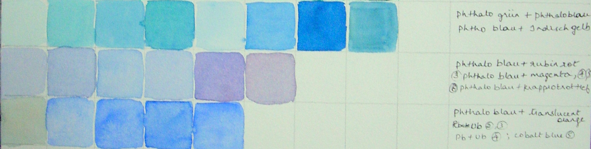
Anyways, getting back to my iris, I made some swatches to match colors as this is a very light valued flower and both the color and the value has to be got just right at the start, as there is not much need of glazing here.

I felt the pale blue was tending towards green and so I tried mixing pthalo blue with a yellow and a green on the top row but I was wrong. It was tending towards red, mixing it with ruby red in the first two coloumns of the second row was the right color but looked dull, in other words the chroma was not at its best. I got it right in the next three coloumns by mixing pthalo blue with magenta. The third row consists of ultramarine and cobalt blue, I might use them to add interest to the painting.
