Color plays an important role in most visual arts, graphic design, interior decor, clothing, packaging…… almost in every area of our life. Knowledge of color will help you in making the right choices for expressing yourself and making a statement with your artwork. Each hue has a symbolic meaning and evokes an emotional response in us, so it follows that different combinations of hues can be made to express subtly or dramatically varied nuances of emotions.
Red stands for energy, courage, passion, drive, power and is attention grabbing. If a bold effect is what you are after, then make red your dominant color. Yellow denotes openness, optimism, hope, happiness, sincerity, honesty, energy. It stimulates the intellect and communication. It is the lightest of all hues, yet in its high chroma form it attracts the most attention and advances towards the viewer. Orange combines the passion of red with the openness of yellow making this a warm and friendly hue. It has outgoing, sociable qualities to it.
Red-Orange combines the energy and passion of red with a hint of the joy and openness of yellow making it an exuberant color that exudes innocent youth. Yellow-Orange on the other hand, combines the honest, open and communicative nature of yellow with just a hint of the energy of the red to make it a welcoming hue. Orange again has more of red, so is more outgoing and sociable.
White speaks of innocence, purity, peace and truth. Black has a grounding quality to it.
Here`s the RYB color wheel again where I have marked the primary (R,Y,B); secondary (O,G,V) and tertiary (RO,YO,YG,BG,BV,RV) colors. Lets begin our color odyssey with one of the basic color schemes – an analogous color scheme. Any three or four adjacent hues on the color wheel make up the analogous hues. For example, violet, red-violet and red. Analogous colors have a harmonious and pleasing effect on the eye.
Here I`ve used reds, red-oranges, orange and yellow orange in their high chroma form. It makes a bold and striking statement with the addition of black. Doing this small demo inspired me to make an abstract painting out of it. Adding gold accents to it gives it a different, rich look. (photo below this one)


This one is made from magenta, red-violets, violets and a bit of blue-violet. It looks more subdued because of the darker values that blue brings.

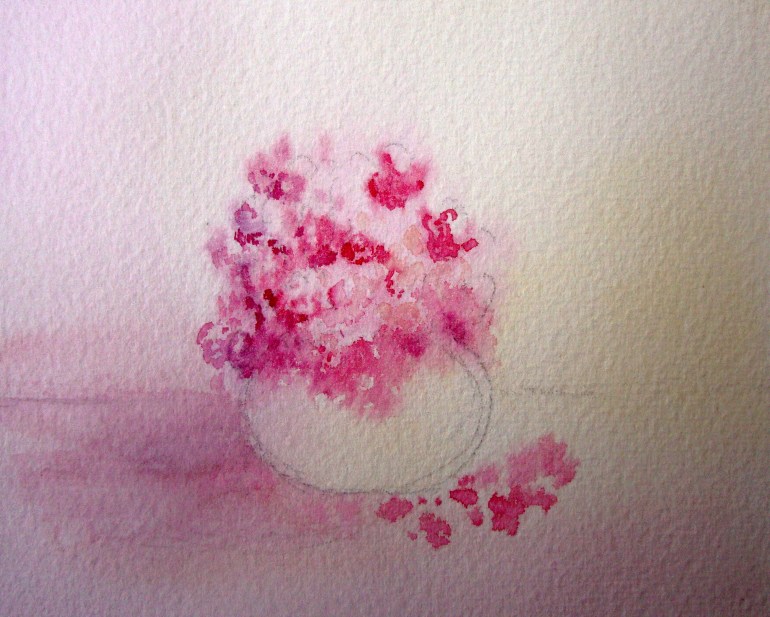
Pink is a tint of cool red (a tint of a warm red tends towards a peachy color not a pink). Red, when combined with the peaceful effect of white, is calmed down, becomes sweeter. It is definitely what can be called a feminine color and is the basis of a romantic color scheme. You can combine different strengths of pinks with white or soft violets. Pale yellows and green-yellows can be be used for accent. In fact, any color next to pink works well for romantic as along as they are of very light values.


Peach is the pale, lovely tint of orange. It is calm and has an air of understated elegance, without any reserve to it.

A pale yellow is central to an elegant color scheme. It has some restraint to it (unlike peach) because it does not have any red in it. It has expansive qualities to it – a room with walls painted in this hue will appear larger than a room with walls painted in red. A living room with pale yellows, creams and the softest of beiges projects restraint, elegance, clarity, grace, intelligence and ease. In places where a white would seem too striking a contrast, a pale yellow would fit right in, also imparting a warmth and softness. You would barely notice the color but it gives a subtle glow to a painting or a room.

At the opposite end, these hues enriched with black project different qualities. Deep reds, maroons, mustard yellows and earthy orange browns are richer and more laid back than the strident pure hues. In painting, these are very useful for intensity contrast. Adding neutral colors like grays and beiges expands this palette even more. They serve as a place of rest for the eye in between other pure colors, be it in art or interior decor.
I`ll go into the cooler colors in another post, until then, be creative and have fun!

I LOVE your blog, especially your comments on colours, colour wheels, favourite palettes, warm/cool colours.. Every artist or art sales person you talk to has a different preference, a different explanation, but there is clarity and common sence to your explanations. Thanks. Keep it up. Wish I could have joined you on your workshop. Sounds wonderful.
LikeLike